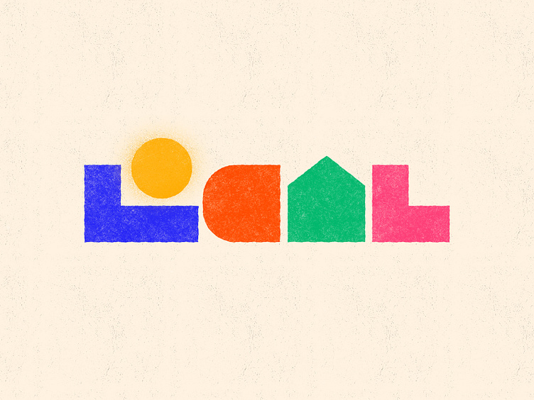
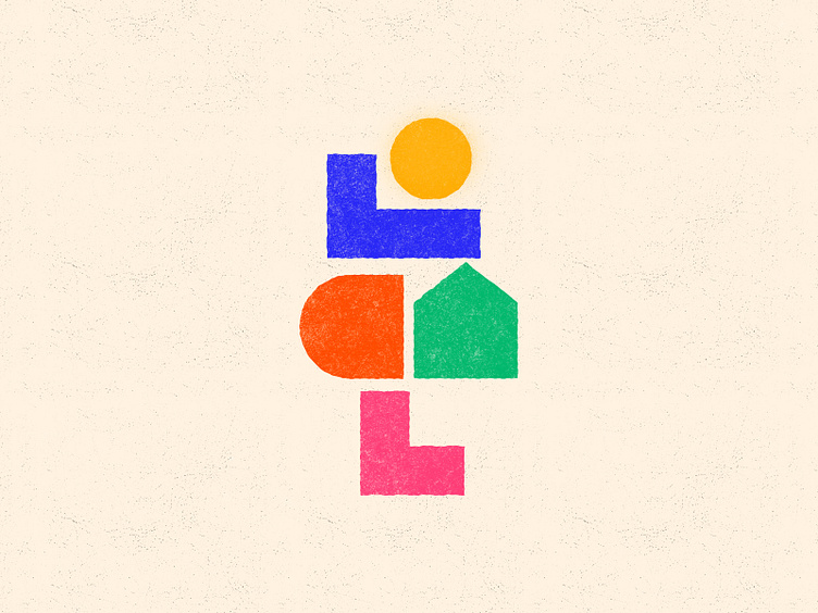
LOCAL - Branding

LOCAL uses minimal shapes to represent a sense of community, warmth, and place. The sun icon evokes feelings of optimism and belonging, while the abstracted house shape symbolizes home and local connection. The use of playful, vibrant colors conveys familiarity and a fresh, modern feel. This concept was ultimately unused by the client.